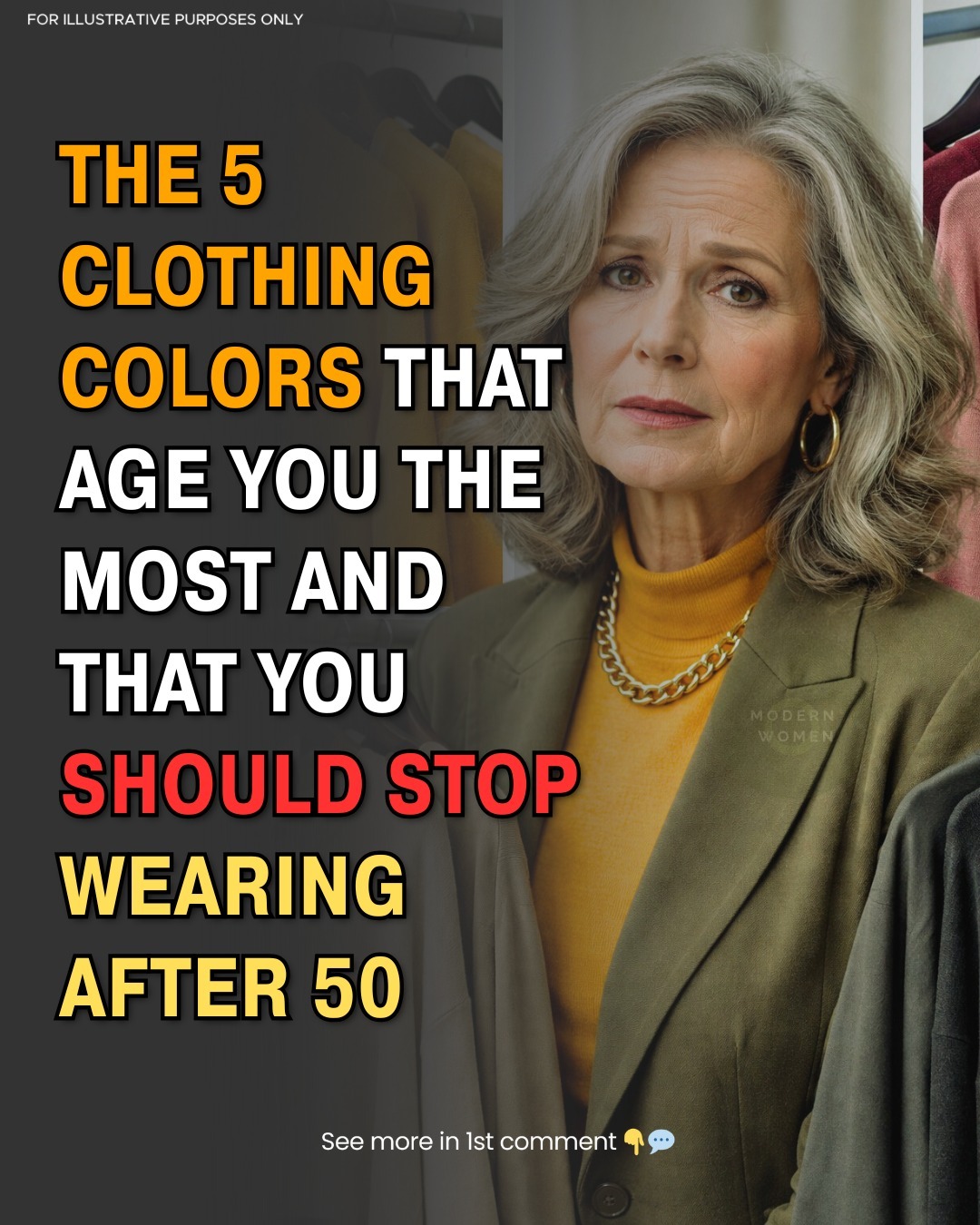
These Popular Colors Might Be Dulling Your Glow After 50 — And Style-Smart Ways to Keep Looking Vibrant
As we embrace life after 50, our wardrobes often evolve — either intentionally or by habit. But one of the most surprising ways your outfits might be working against you isn’t about style or fit… it’s about color. Certain hues that looked flattering in your 30s and 40s can now wash you out, dull your complexion, or accentuate tiredness around the eyes. The good news? With a little color awareness, you can make your complexion look brighter, more youthful, and full of life.
Why Color Matters More After 50
As skin matures, undertones shift and contrast subtly softens. Colors that are too cool, too muted, or too flat can absorb the light rather than reflect it — and that makes your face look less vibrant, even if you feel great inside. When your clothing is near your face (tops, scarves, jewelry), the color effect is magnified.
Many women naturally gravitate toward classics like gray, black, beige, or stark white — but wardrobe safe choices can sometimes be color traps that drain your glow, especially when worn head-to-toe.
Common Colors That Can Dull Your Look After 50
Here are some widely loved colors that may not be doing you any favors — especially if paired without contrast or warmth:
1. Ashy or Cool Gray
Gray feels timeless and sophisticated. But ashy or smoky gray tones can be particularly unflattering. They lack warmth and absorb light, making skin appear flat and tired — especially around the eyes and mouth.
👉 Style tip: If you love gray, choose versions with warm undertones (think taupe, stone, greige) and pair them with a warmer accent nearer your face, like cream or peach.
2. Stark White
Classic white looks crisp and clean in photos and formal occasions, but when worn close to the face it can cast a faint shadow that highlights texture and lines — especially in natural lighting.
👉 Better alternative: Soft white, ivory, eggshell, or cream reflect light gently and brighten your skin without harsh contrast.
3. Solid Black Near the Face
Black is iconic and slimming — so much so that many women over 50 default to black tops and dresses. But pure black creates sharp shadows that emphasize fine lines and under-eye hollows.
👉 Try Instead: Richer neutrals like charcoal, navy, or chocolate brown offer depth without harshness. You’ll get the same chic effect with far more flattering results.
4. Muted Neons or Harsh Brights
Neon colors paired with black or other dark shades create an intense, almost jarring contrast that often reads harshly against mature skin.
Even seemingly cheerful shades like mustard yellow or soft yellow can appear muddled and faded, rather than fresh and glowing.
👉 Style tip: Look for richer or warmer versions of these hues — like marigold, golden yellow, or mustard with rust undertones — which harmonize better with skin tones.
5. Tan + Soft Yellow Together
When two similar low-contrast neutrals like tan and soft yellow are worn together without a contrasting accent, they can literally blend into one another and make your complexion look washed out.
👉 Fix: Break up the combination with color pops — cream, denim blue, or even burgundy accessories work beautifully.
6. Muted or Muddy Purples
Purple can be beautiful — but grayish, subdued purples tend to lack the vibrant pigment necessary to lift mature skin.
👉 Better Purples: Look for richer jewel tones like aubergine, plum, or cranberry hues instead.
The Colors That Boost Your Glow After 50
Now that you know what to avoid, let’s talk about colors that truly brighten your look and accentuate your natural undertone:
1. Warm, Vibrant Neutrals
Instead of dull neutrals, choose warm ivory, soft camel, and warm blush near your face. These reflect warmth and healthy pigment back into the skin.
2. Jewel Tones
Deep saturated colors like emerald green, sapphire blue, ruby red, and burgundy add depth and presence without overwhelming your features.
3. Coral and Peach
These colors mimic the natural warmth of sun-kissed skin and bring youthful glow, especially for warmer undertones.
4. Turquoise and Seafoam
These coastal tones sit between crisp and warm — cool enough to refresh, warm enough to enhance — and are especially striking near the face.
5. Navy & Charcoal (as alternatives to Black)
These are timeless, elegant, and far softer than black near the face. They still read as chic and powerful but are easier on mature skin tones.
How to Apply These Color Rules With Confidence
Here are practical ways to put this color wisdom into everyday outfits:
🔹 1. Start Near the Face
Always consider the color closest to your face — a top, scarf, jacket lapel, or even jewelry. A flattering color here does more for your look than the rest of the outfit combined.
🔹 2. Mix Warm and Cool Strategically
If you choose a cool base piece (like navy), balance it with a warm accent (like coral or cream) near your face.
🔹 3. Test in Daylight
Indoor lighting can be forgiving. Step outside — if a color makes your skin look dull or gray, try it further down your outfit (like pants or a skirt) instead of near your face.
Final Takeaway
What you wear after 50 should feel empowering — not age-defining. While fashion trends come and go, color psychology and contrast remain constant. By steering clear of overly cool, ashy, or flat colors near your face and embracing hues with warmth and vibrancy, you can keep your wardrobe working for your glow, not against it.
